What if the web was inaccessible to everyone?

Picture the scene:
Your friend sends you a link to their new favourite ecommerce store (not built by San Digital), you have to buy their Products™!A slider? What on earth is that for?
You wonder if it’s just easier to ask your friend to order it for you and avoid this despair.
Everyone deserves to be able to access the same resources - independently and without frustration. Buses have low floors to make them easier to board, road crossings have tactile pavements, TV shows have captions, and websites should be accessible.

Regardless of any disabilities, a person should be able to do what they need to, with a similar amount of time and effort as anyone else. The first step to achieve this is to understand the problems you are trying to solve. Luckily there is a technical standard to help with this, WCAG. It contains guidelines which are grouped into levels to achieve a consistent standard of accessibility.
The WCAG standard defines three compliance levels, for minimal, acceptable and optimal compliance (A, AA, AAA respectively). For your site to be compliant it needs to follow all the guidelines for a given level, as well as the level below it. If your website doesn’t meet any level of compliance it is impossible or exceedingly difficult to use for some users.
If you’re less interested in the details of how to achieve accessibility but still want to understand it from a product or design perspective there is plenty of content out there for you too.

To make accessibility guidelines less abstract and easier to understand it’s a good idea to review the foundations that the guidelines are organised around.
The WCAG specification can be overwhelming and identifying parts of your website isn’t easy even if you know what you’re looking for - it can be hard to tell where to start.
The good news is there are plenty of tools which fit into whichever trophy or pyramid you use to decide how to test your codebase. While a tool won’t solve all of your problems there’s no excuse for letting easy-to-resolve accessibility issues through to production because you have no way of testing for them.
Eslint jsx a11y plugin is a static code analysis tool, the best time to find out about accessibility issues is as soon as you make them. Add this plugin to your project and VS Code will immediately highlight issues in your webpages without any extra testing effort. Since this is a code analysis tool there is a limit to what it can pick up (For example custom components can cause some confusion - is it a button? Is it an image?), but it’s low effort to add to a project and configure.
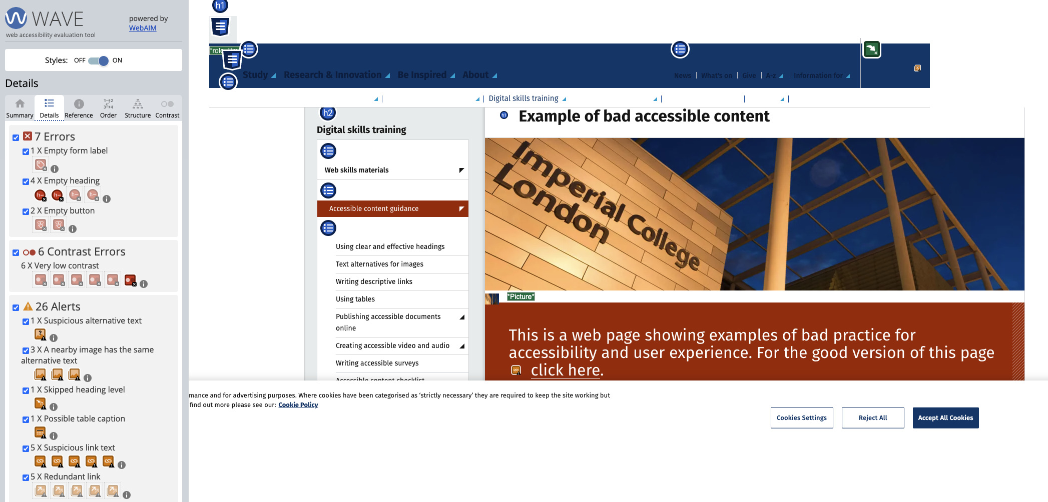
For more reliable insight into accessibility on your web page you’ll want to test the rendered output. The WAVE browser extension provided by Webaim is perfect for some quick manual testing of a web page. Install it then right click the page you want to test to “WAVE this page” and you’ll get a list of accessibility errors and alerts, along with references explaining what the issues are and why and how to fix them. It helps with testing page structure and order for page navigation, and contrast and styling for harder to spot accessibility issues.

If you are lucky enough to be in a position where you have automated testing as part of your development and deployment workflow you can include Axe (An accessibility testing engine) plugins for Jest or Cypess. Axe gets injected to your web page at the start of a test, and you can configure which rules you want to run and Axe will fail any test that violates those rules.
There are more issues these tools can’t fix - if your images have poor contrast and labels or alt text that is just unhelpful then your website isn’t actually any more accessible than if they weren’t there.. In fact it could be less! Automated testing for these types of problems aren’t widely available (yet, someone must have started making a ChatGPT powered accessibility context validator) so you need to be aware of the “why” behind these accessibility guidelines to ensure you are helping, not hindering. The UK Government has some great resources on this kind of thing.
The barrier for entry to accessibility testing has never been lower, like your website after you start using these tools.
Let’s do something great